Monday 16 May 2011

Fella's what can I say?


We did good guys! I have to say this has been the best creative experience on this course so far and it has been an outstanding pleasure to have created something with you guys that nobody can ever refuse. Congrats all round!

It's been pimpin'!

Thank you

I'd love to say again: Huuuge thank you, guys, I enjoyed this project big time and I love the final book, looking forward to see it printed in colour and on proper paper tomorrow. Thumbs up for assessment tomorrow!

Sunday 15 May 2011

Tim Sale


Comic book artist Tim Sale, was an appropriate source of inspiration for this project for his monochromatic images and dynamic compositions with his images. He also has a much looser approach to drawing which I found inspiring and incoperated that aspect into the line work of my drawings as I knew I didn't have time to do very tight precise images for this module.

I love the visuals for this game which is presented primarily in a monochromatic black and white tones, using lighting, film grain effectsto create an eerie atmosphere, often associated with horror genre. It's dark presentation is comparable to film noir and German expressionism.

Geoff Grandfield


Geoff Grandfield was perfect to look at an artist that has done work for crime novels. His work incoperates the aesthetics of a film noir visual, with the greys adding a feel of colour through its contrasts with the stark black and white despite their of course being no colour present. Also has a vintage feel with the visual look being somewhat reminiscent of old art deco posters with its bold precise geometric shapes, that being minimalistic convey alot of information with simple characters within a moody composition.

Bruce Timm


Bruce Timm was another source of inspiration with his visuals being art deco inspired. And visually it suits the context of a 1930's setting with his miminalist angular style is heavily based on his passion for 50's 60's era comic books and art deco architecture.

Darwyn Cooke


Darwyn Cooke is another artist whio is quite similar to Bruce Timm with a clear inspiration from 50's and 60's era comics, though he does more comic based work whereas Bruce does mostly animation. His work on the Parker series proved most influential as it was a crime based novel so compositionally it would be similar to what we would aim to capture in our comic. His backgrounds tend to be quite simplistic in nature but again the viewrs mind can fill in the gaps and fully create what is being suggested by the line work.

Friday 13 May 2011

Thursday 12 May 2011

Testing typeface


Hey guys! Do you think this typeface works? Much love, Benj

Wednesday 11 May 2011

Printing & reproduction

As our comic draws nearer to completion (yeeeeeah boys!), there's a few things we'll need to consider about the printing process.
  • What is the page count going to be in total with all our pages, are we going to add extra?
  • Is there going to be back covers as well as front covers?
  • Are we going to print A5 or American Comic book format (17x26cm)?
  • What type of paper are we going to print on?
  • Are we going for high quality (e.g. from The Hub) or just normal Uni printers?
We probably need to get the whole thing together in InDesign by Sunday evening to print on Monday.

Take care guys =) See you soon

Info on my story so far...

Technicality wise I have used market deco from da font website as well as bellerose for title type. Also stroke on the bubbles is 10. Also Benj 'red' does not scream curses instead i have left it silent since i felt the images and monologue carry and convey his emotions more than a verbal outburst.

Monday 9 May 2011

Carlo

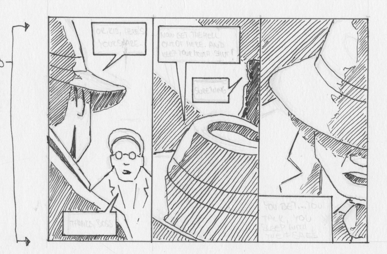
There you go, Benj, here's the idea of Carlo's character, as I mentioned before, is a silly looking guy, big forehead, Lennon look-like glasses, rather big ears and silly hat. I guess he's wearing cheap suit, classic shape, nothing complicated.
For the purpose of our comic I'll be only using the part of the third page in the red square. I had to shrink the conversation between these two characters to save some space, it didn't really deserve page and a half, that wouldn't be necessary.

The rest of the third page is here, as I said, I squeezed it into three panels, rather dedicate a whole page to it.

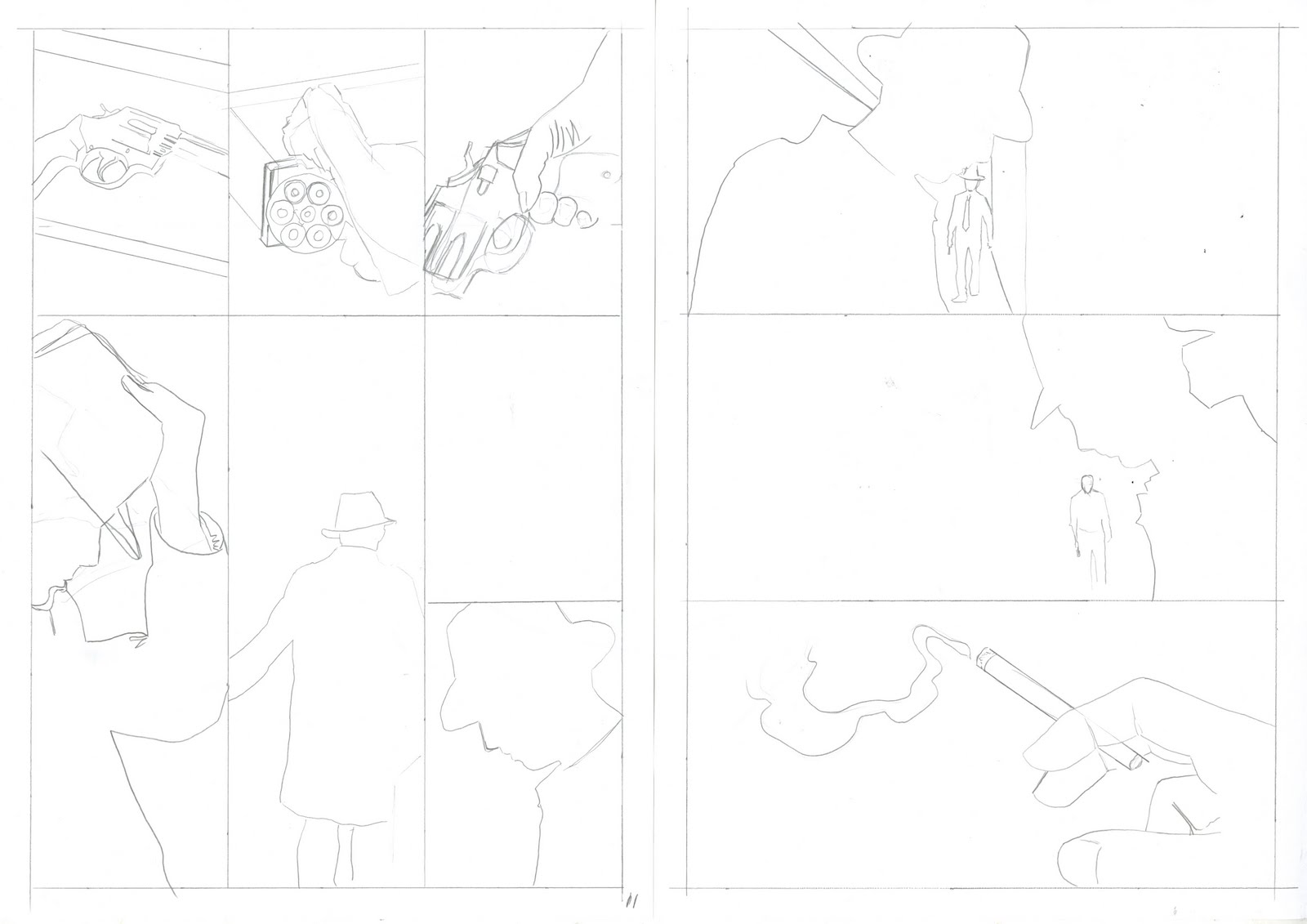
And here's the fourth page and beginning of the fifth one:

Sunday 8 May 2011

Roughs for 'Easy Money'

Here's the roughs for Lawrence Shaw's chapter. I'm still pondering over the mysteriously absent page 10...hmm.


Thursday 5 May 2011

The street of death


Benj this the street where the car chase shooting is held

Link to Illus course blog

Also, could you guys please attach a link to illustration blog our year shares? I can't get there for some reason, thanks!

Ondrej's rough

Hey guys, here's the first double page spread I promised to post on the blog and also another version with a little test using the colour I chose. It is an initial idea, nothing finished yet, but it could give you an idea what it's going to look like. I also like different approaches we chosen for each one's process of building the imagery. Such as Dave's really really rough roughs ( eh..? ) and then taking them to nicely clean and neat finals, Benj's complex roughs and rather similar yet more pimped up finals and finally me - I'm going to get those roughs done in rather finished way, then blow them up and retrace them on lightbox ( thanks for suggestion Dave, I think it suits me and the way I work ). Good job everyone, I can't wait for the final outcome! Good luck and remember - IMAGES ARE OUR FRIENDS!!! :-)

Tuesday 3 May 2011

The League of Extraordinary Gentlemen

Another nice example of the use of the 9 panel layout. Good stuffs ya!


WATCHMEN - Alan Moore & Dave Gibbons


The good old Watchmen, will they ever successfully colour it? Anyhew, it uses a 9 panel layout, something good to look at. Yeeeah!

BLACK ORCHID - Dave Mckean and Neil Gaiman


Black Orchid, found it in the library. It's a cool graphic novel written by Neil Gaiman and illustrated by Dave McKean. The panels are nicely laid out and the shots are well angled. I like how Dave McKean blends black&white with colours. Check out the panel with the guy lighting his cigarette, I was going to do that too! Anyhew, hopefully this is useful.

Roughs - Pages 1-4


Hey boys! Here are my roughs for pages 1-4, still haven't conquered the next eight pages but thought i'd better post something! Muchos love

Story update on Red

I have now cut my story from 16 to 12 pages and i am no longer doing a double page spread for the car chase sequence so that wont cause problems that would hamper the indesign process. Also the death of the bank clerk is cut out and the whole thing where the clerk sets the alarm off during the robbery and the argument between big six and dint as those parts arent necessary to the story and probably slows it down. So im back on course baby!

Monday 2 May 2011

...and more of Mike Mignola

Hey I finally made a scanner work, just needed a while to warm up! So there's few more scans from the Batman meets Jack the Ripper comic ( this time the actual inside of the book ). Just a little note: Mignola is responsible for a pencil drawings in this one, inks are done by P. Craig Russel and David Hornung is the colour artist. Script was written by Brian Augustyn.


Mike Mignola

Interesting guy to look at, mainly known for his Hellboy comics, but I got to know him through rather older Batman comic, where the Batman encounters Jack the Ripper, from 1989. I'm sure you're aware of that, but there is ( or isit still...? ) a book shop down the old market, where you can find some pretty nice old comic books for a bargain price really. Worth poppin down there I think.

And few images from Mike:


Not like it's going to help us in any way...

...I mean reference-wise, but just look at this beauty :-) Thinking about sequel of our little thing going on, I would call it "The Musician" :-)